After changing my idea from the previous I have now created an idea that would realistically work within the education system for the students. My new project idea is an interactive university navigation based app. By using GPS the app tracks where a bouts on campus you are. This app helps lost students find their way to their class. The app gives you the option to either browse around the campus or you are able to put in the code for you room eg. MC2113B and from where you are now the app will help navigate you in the right direction.
Starting off I drew down a few ideas for logo ideas for my product. Wanting to include connection of both education and direction my mockup ideas consisted of mainly compasses, graduation hats and lost signs. Trying to encorporate these ideas I then went onto Photoshop and tried to put these ideas into something that looked aesthetically pleasing.
IDEA 1:
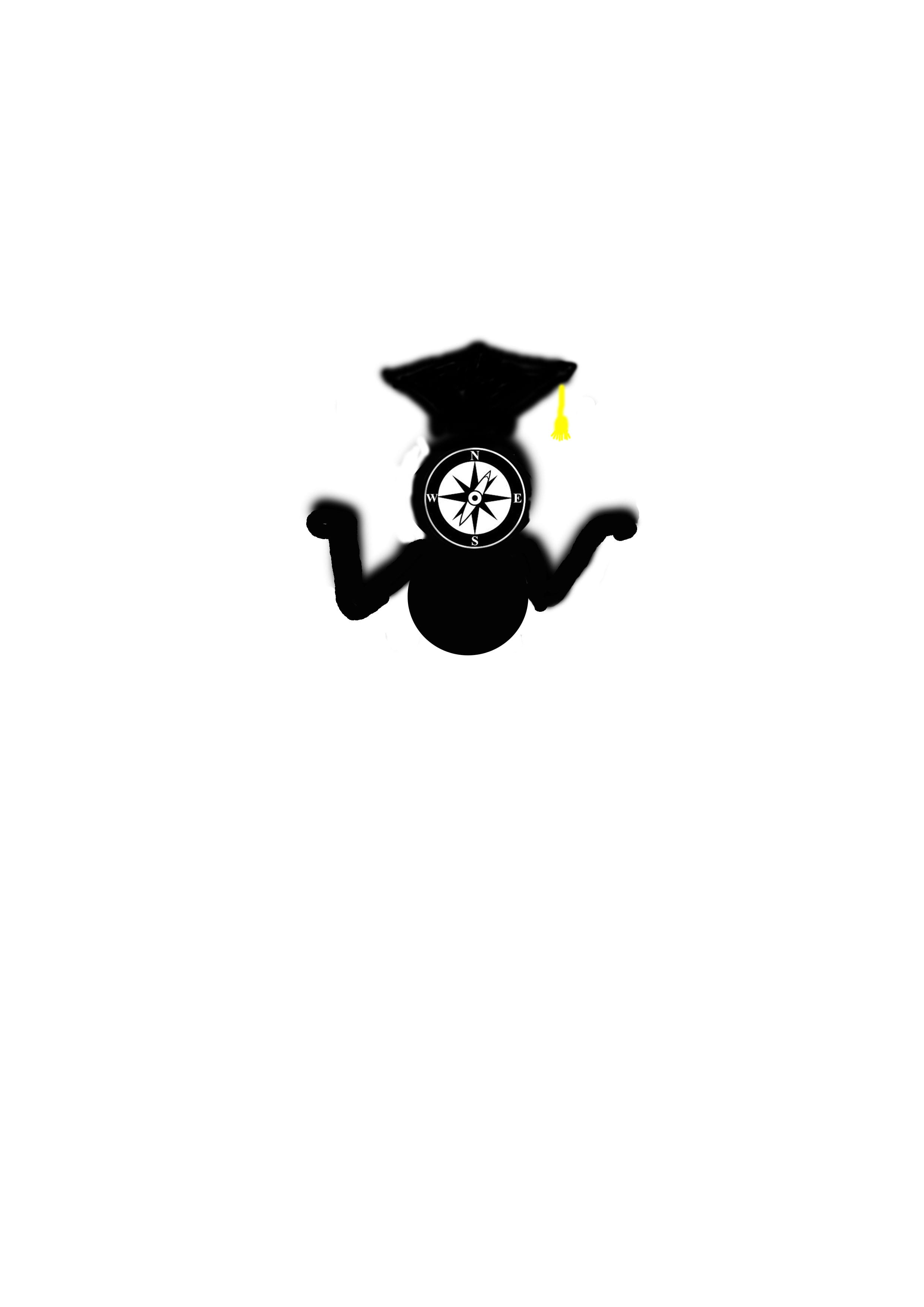
Im not too fond of my first design idea because if feel as if its quite comical and the images that i have placed together don’t look very appealing to the eye. I need simplicity. The icon is quite small too so you are really unable to see the compass in the middle. What i liked about this idea was the compass, so if I want it to be seen I should probably make it the main point of focus. Which brings me onto IDEA 2.
IDEA 2:
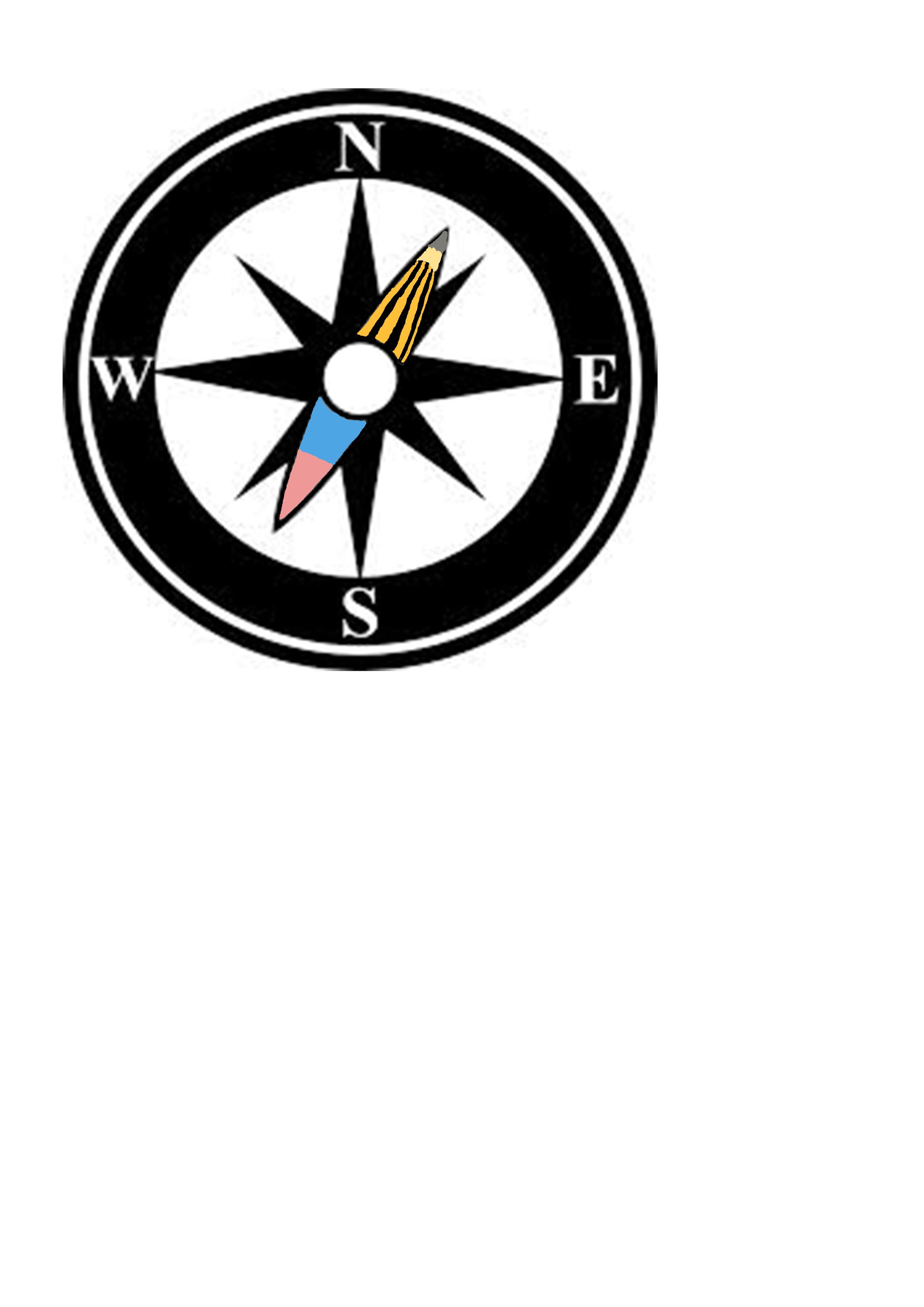
I liked the look of IDEA 2 much more because of the link because direction (compass) and education (pencil and rubber). This idea is very simple and was easy to create. IDEA 2 looks much more professional and could actually be used for a real product.